1.13 Propensity Score Distributions
For inferential analyses, the QRP Reporting Tool can output histograms depicting the distribution of propensity scores in the exposed and reference cohorts before and after adjustment. The histograms can be output for inferential analyses of exposure follow-up time and outcomes, as well as for inferential analyses of exposure and outcomes during pregnancy. Separate histograms will be output for the overall analysis and any subgroup analyses, if specified. The propensity score (PS) distributions available to output vary by analysis type and are detailed in Table 1.24.
| Analysis Type | Number of distributions available | Distributions available |
|---|---|---|
| 1:n fixed ratio PS matched analysis | 2 |
|
| 1:n variable ratio PS matched analysis | 1 |
|
| Unweighted PS stratified analysis | 1 or 2 |
|
| PS stratum weighted analysis | 3 |
|
| Inverse probability of treatment weighted (IPTW) analysis | 3 |
|
| Covariate stratified analysis | 0 | Not applicable |
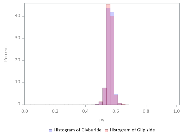
These plots are used to assess the degree of overlap in the range of propensity scores between the exposed and reference cohorts. Sufficient overlap between the two exposure groups is needed because no inferences about the effects of treatment can be made for an exposed individual if there is no person in the reference group with a similar propensity score.
1.13.1 Requesting Histograms
Users can request propensity score distributions using the [Figure File], specify which analysis groups from QRP to include in plots using the L2 Comparison File, and specify analysis group labels using the Label File. When no label is specified, the figure is labeled with the name of the analysis group as it appears in the QRP input files. By default, histograms are aggregated across Data Partners. An option to output Data Partner-specific histograms is available.
In the Excel version of the report, propensity score distributions appear in blue tabs and are labeled as Figure 1 in the report.
1.13.2 Titles
All propensity score distributions are labeled as “Figure [#][letter].” Titles for distributions that include unadjusted and adjusted propensity score histograms will be: “Histograms Depicting Propensity Score Distributions Before and After Adjustment for [Analysis Group Label] in the [Database Label] from [Query start] to [Query end]”. Titles for distributions that include only unadjusted propensity score histograms will be: “Histograms Depicting Propensity Score Distributions Before Adjustment for [Analysis Group Label] in the [Database Label] from [Query start] to [Query end]”. If the histogram represents a subgroup analysis, rather than an overall analysis, [Analysis Group Label] will instead be replaced by [Analysis Group Label], [Standard Subgroup Label]: [Subgroup Category].
1.13.4 Example
Figures 1.7, 1.8, and 1.9 depict propensity score distributions before and after adjustment for an analysis comparing risk of cardiac events in glyburide users to glipizide users in the SynPUFs data from January 1, 2008 to September 30, 2015.19
 {fig.align = ‘center’}
 {fig.align = ‘center’}
 {fig.align = ‘center’}
Please note: The results presented in Figures 1.7, 1.8, and 1.9 are based on synthetic data and should not be scientifically interpreted. These examples were created using the Medicare Claims Synthetic Public Use Files (SynPUFs). More information about SynPUFs is available on the Sentinel Website.↩︎