1.14 Forest Plots
For inferential analyses, the QRP Reporting Tool can output forest plots based on effect estimates generated by qrp_report when specified by the user. Forest plots visualize hazard ratios and 95% confidence intervals (CIs) for inferential analyses of exposure follow-up time and outcomes. For inferential analyses of exposures and outcomes during pregnancy, forest plots visualize risk ratios and 95% CIs.
1.14.1 Requesting Forest Plots
Users can request forest plots using the [Figure File], specify which analysis groups from QRP to include in plots using the L2 Comparison File, and specify analysis group labels using the Label File. When no label is specified, the figure is labeled with the name of the analysis group as it appears in the QRP input files.
In the Excel version of the report, forest plots appear in blue tabs and are labeled as “Figure 2” in the report if Propensity Score Distribution Histograms are requested; if not requested, forest plots are labeled as “Figure 1”.
1.14.2 Populations to Output Forest Plots
The data points shown on forest plots include the overall cohort as well as subgroups specified in QRP input files. These subgroups can be specified by using the qrp.PSMatchFile, qrp.StratificationFile, qrp.CovStratFile, and can include age, sex, race, Hispanic origin, year, monitoring period, and/or a user-specified covariate.
One plot is produced per analysis type, with multiple analysis groups presented in one plot. The different analysis types that can be plotted include:
- Site-adjusted analyses
- Propensity score matched conditional analyses
- Propensity score matched unconditional analyses
- Propensity score stratified analyses
- Propensity score stratum weighted analyses
- Inverse probability of treatment weighting analyses
- Covariate stratified analyses
For analyses of exposures during pregnancy, the forest plot subgroups can also include the match method used to identify mother-infant pairs, the birth type, the gestational age categories, the pregnancy outcome, and the pregnancy outcome categories.
1.14.3 Information Presented in Forest Plots
The forest plot contains the overall and subgroup name labels along the left side, with the hazard/risk ratio and 95% CI for each along the right side. The graphic plots the hazard/risk ratio estimate and the width of the confidence interval for each subgroup shown. The x-axis of the forest plot graphic is shown on a logarithmic scale. For any groups with a CI that exceeds the scale of the graphic’s x-axis, the plot is shown to the end of the x-axis. For more information on how hazard ratios and risk ratios are calculated, see the documentation section on Effect Estimates.
1.14.3.1 Titles
All forest plots are labeled as Figure [#][letter]. Titles for forest plots are as follows: “Forest Plot of Hazard Ratios (HR) and 95% Confidence Intervals (CI) for [Analysis Type Title].” For the full list of analysis types, see Populations to Output Forest Plots above. In inferential analyses involving exposures during pregnancy, “Hazard Ratios (HR)” will be replaced with “Risk Ratios (RR).”
1.14.3.2 Footnotes
If a hazard ratio cannot be calculated for any of the analysis groups listed, then the footnote “Hazard ratio could not be calculated for all analyses” is included. In inferential analyses involving exposures during pregnancy, “hazard ratio” will be replaced with “risk ratio.”
The user can put additional information in footnotes by using certain parameters in the QRP:
- Ratio and Caliper: footnote shows the ratio and caliper for each Propensity Score-matched analysis group, as well as whether it was a conditional or unconditional matched analysis: “[Fixed/Variable] Ratio 1:N Propensity Score Matched [Conditional/Unconditional] Analysis; Caliper= CALIPER” where
CALIPER,RATIO, and Conditional/Unconditional values are based on user inputs in theqrp.PSMatchFile.- Note: each analysis type is on a separate tab, so conditional and unconditional results never appear in the same figure.
- Weight: footnote shows the weight used for inverse probability of treatment weighting (IPTW) and Propensity Score stratum weighted analyses.
- “Weighted using average treatment effect (ATE) / average treatment effect in the treated (ATT) / average treatment effect, stabilized (ATES)” where weighting method based on user inputs in
qrp.StratificationFileandqrp.IPTWFile.
- “Weighted using average treatment effect (ATE) / average treatment effect in the treated (ATT) / average treatment effect, stabilized (ATES)” where weighting method based on user inputs in
- Percentiles: footnote shows the number of percentiles for Propensity Score stratum weighted and unweighted Propensity Score stratified analyses.
- “Percentiles: #” where # is based on user inputs in the
qrp.StratificationFile.
- “Percentiles: #” where # is based on user inputs in the
- If multiple analysis groups share the same values for these (i.e., three of four analysis groups in plot use fixed ratio 1:1. caliper 0.05) then the three share the same footnote value. The fourth analysis group with a variation in those values (e.g., fixed ratio 1:1, caliper 0.025) has a different footnote value.
- Footnote number appears at end of analysis group labels.
1.14.4 Example
Figures 1.10 and 1.11 display the forest plots for Propensity Score-adjusted matched cohorts (conditioned and not conditioned on matched set), for the overall cohort and select subgroups.20
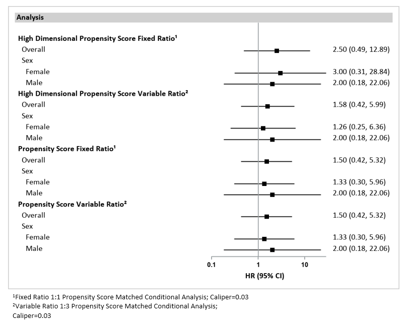
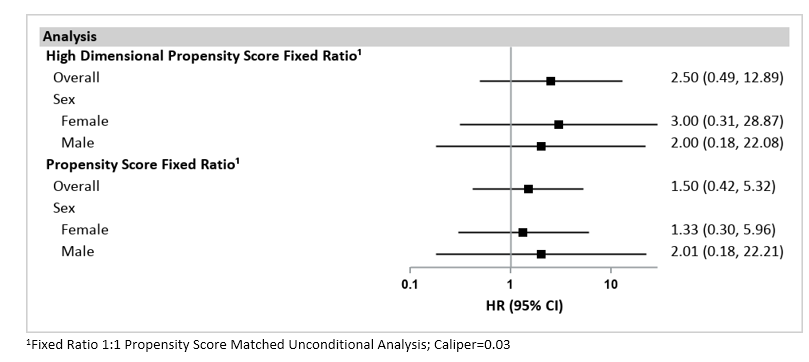
Please note: The results presented in Figures 1.10 and 1.11 are based on synthetic data and should not be scientifically interpreted. These examples were created using the Medicare Claims Synthetic Public Use Files (SynPUFs). More information about SynPUFs is available on the Sentinel Website.↩︎